
Context.
Arrow Global, the European leader in vertically integrated alternative asset management, challenged us to create the naming and identity for its new company: a platform that takes on the strategic vision for the group's entire real estate portfolio in Portugal.
With the goal of selling 2,500 units over three years, the company manages a portfolio of six destinations, establishing Arrow Global as a leading player in the real estate, hotel, sports, and leisure sectors in Portugal.
Immersion.
The immersion phase involved interviews with the leadership of Arrow Global and the new platform to understand their areas of activity and identify their interlocutors: monitoring all stages of each project, from the initial concept to the relationship with the end customer, ensuring consistency, efficiency and a customer-centric approach, always in collaboration with the various entities of the group.
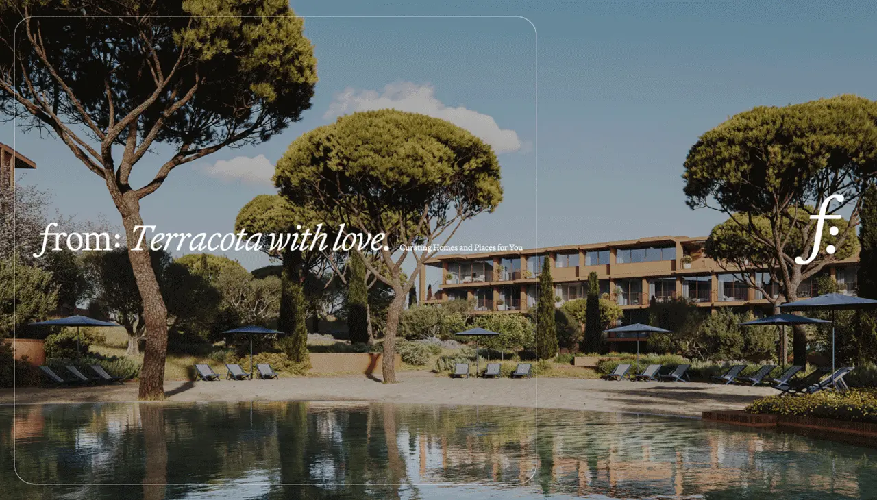
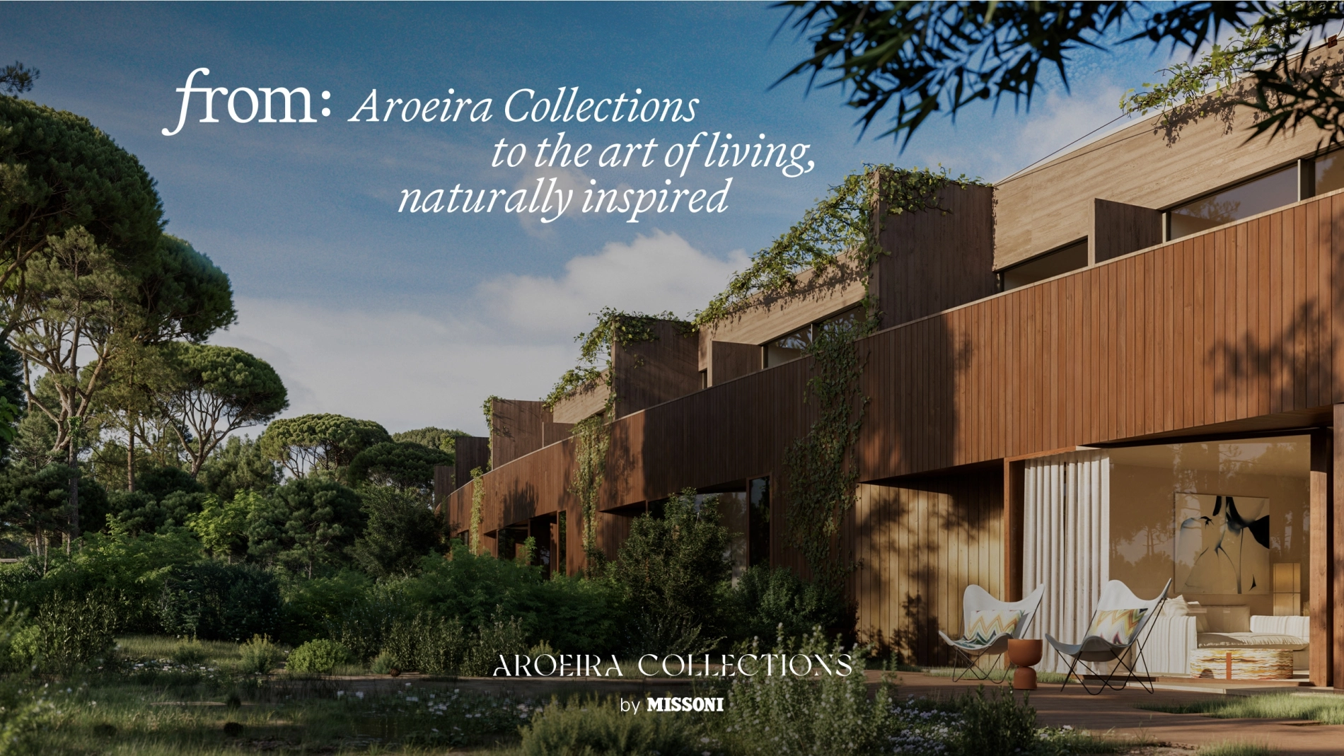
Among these products are large-scale projects: six integrated destinations ranging from branded residences, such as Aroeira Collections by Missoni, to world-class lifestyle destinations, such as Palmares Ocean Living & Golf in Lagos, Sutaya and Azuya in the Golden Triangle of the Algarve or Vale Pisão in the Porto metropolitan area, and exclusive projects in Vilamoura, including Nobilus and Terracota.
It was therefore necessary to create a name and identity that would not compete with these brands but would add value.
Naming.
We have created a name that is flexible enough to accommodate the diversity of Arrow Global's offerings while also reflecting the connection experience these places provide.
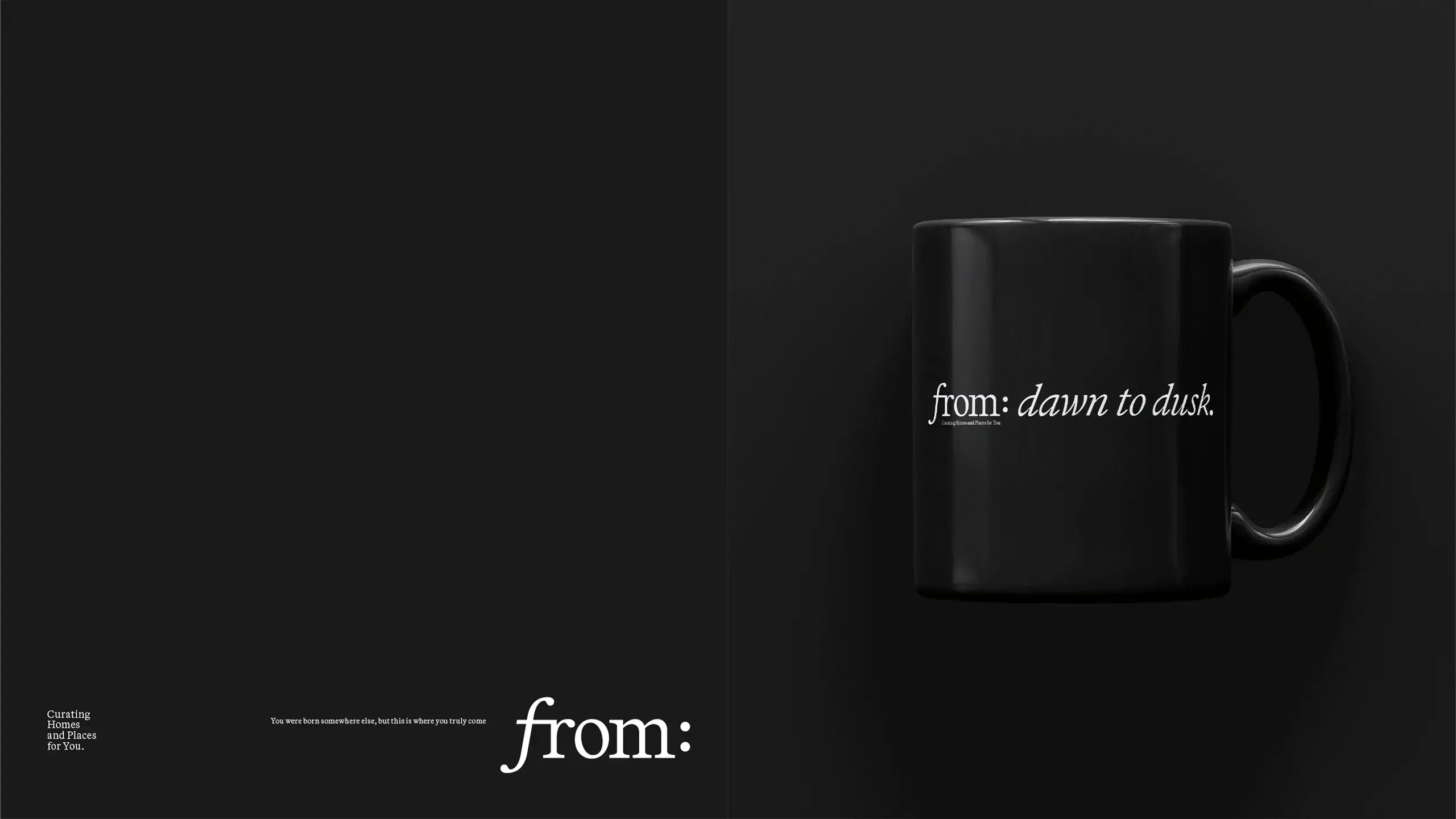
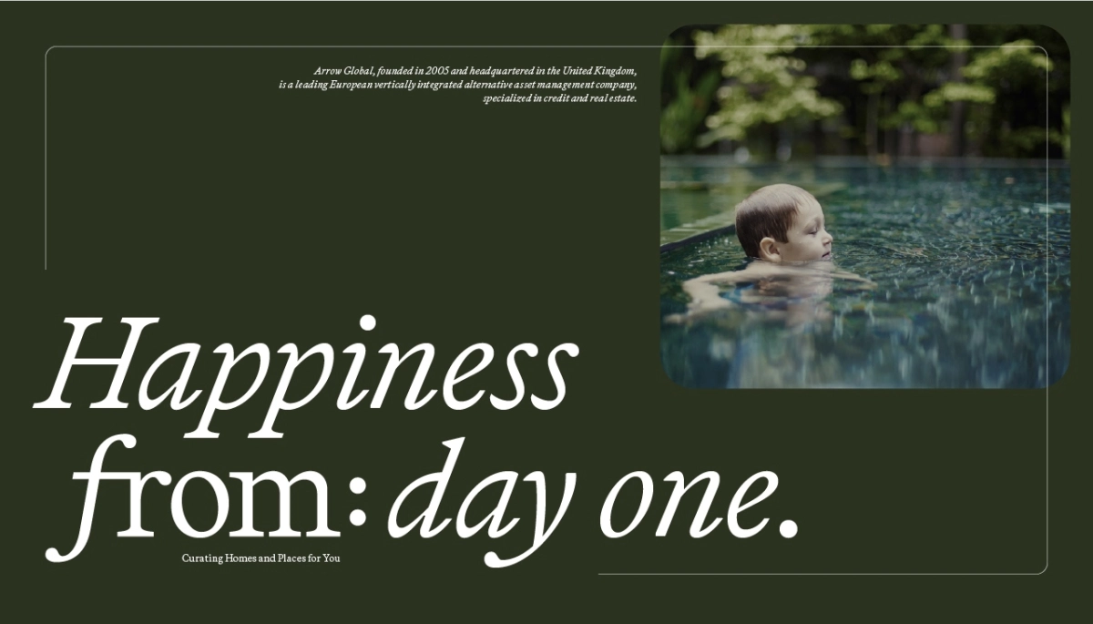
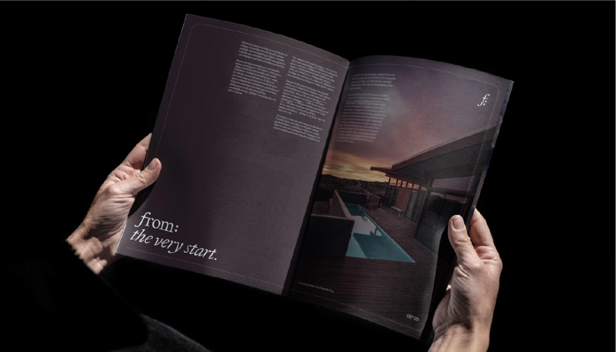
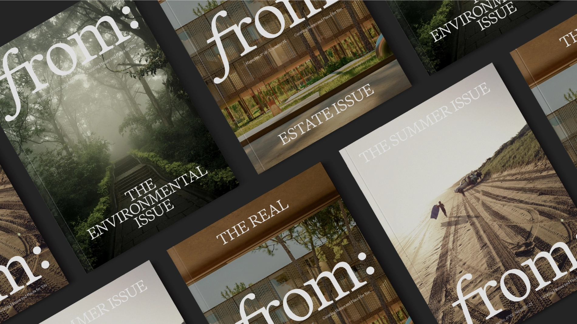
From: means origin. The place where we belong, where we feel at home. But it also conveys authorship. It is the vision and experience of a company specialising in creating destinations that combine architecture, lifestyle and services in a unique way: ‘Curating Homes and Places for You.’

Identity.
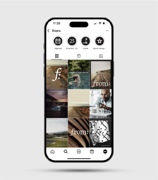
Given From:'s ambition and the scale of Arrow Global's portfolio, we created a strong identity that expresses itself with clarity and intention, reinforcing its position as a guide in the real estate and placemaking ecosystem.
The purely typographic logo, in Italic, reinforces a sense of authorship and the team's attention to detail in each project. The serif font conveys the timelessness and confidence sought in the world of real estate and investment.
The two dots are a graphic element that creates connection and opens up meanings and conversation. They also embody From:'s verbal identity, which is versatile and open, allowing the company to explain its value proposition and encompass Arrow Global's entire real estate offering.
‘The name aims to emphasise From:'s ability to create the perfect match between owners and the various projects and destinations in its portfolio. It speaks of belonging and integration, something that stems from the know-how of the team and partners and is emphasised in the tagline 'Curating Homes and Places for You'.”
Duarte Vilaça, CCO of Born.
“The creation of From: represents a very important moment for Arrow Global Portugal, and this vision took shape thanks to our partnership with Born. We wanted a B2C brand capable of reflecting the scale of our portfolio, our commercial ambition, and the unique excellence we want to bring to the end customer experience.
Working together has allowed us to build a brand that conveys the innovation, scale and integrated approach we want to bring to the Group's real estate projects. From: is not just a new identity — it is a company that elevates our relationship with the market and reinforces our ability to create truly unique proposals.”
Benedita César Machado, CEO of From:

