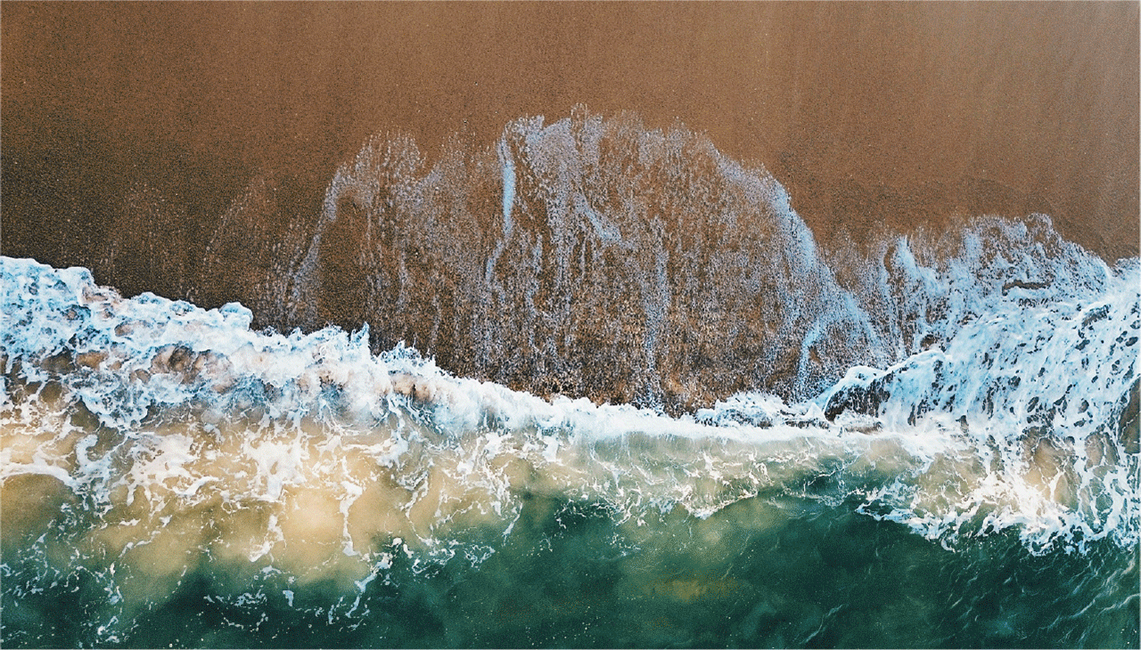
Exclusivity lies between the blue of the estuary, the sea and the sky of the Algarve.
Context
The Algarve's Golden Triangle is marked by large-scale villas — properties that require constant maintenance, permanent staff and complex management, which deters many buyers looking for a second home.
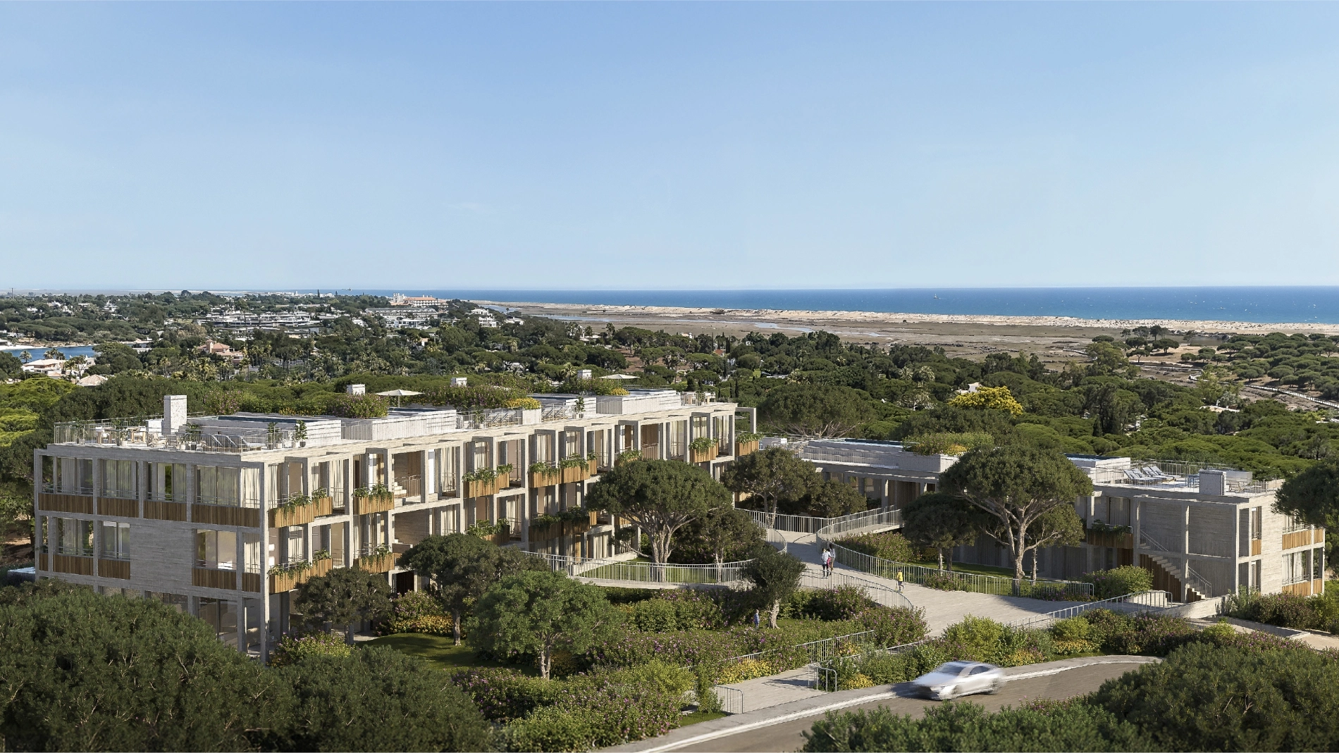
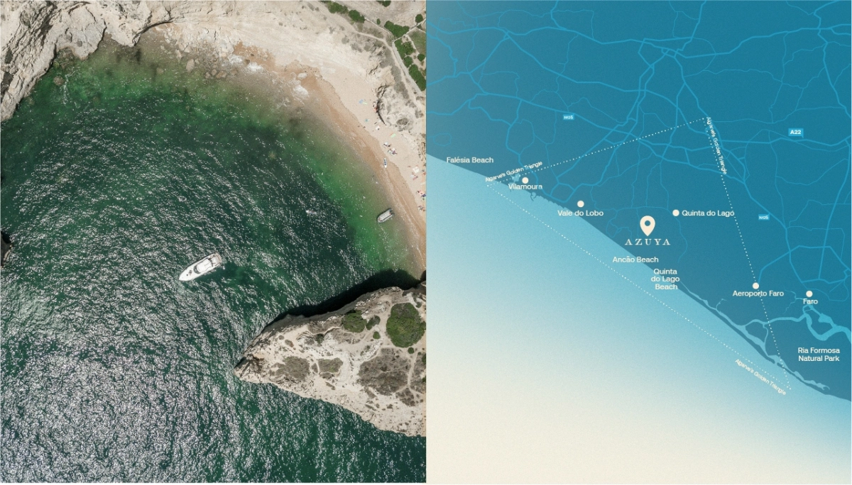
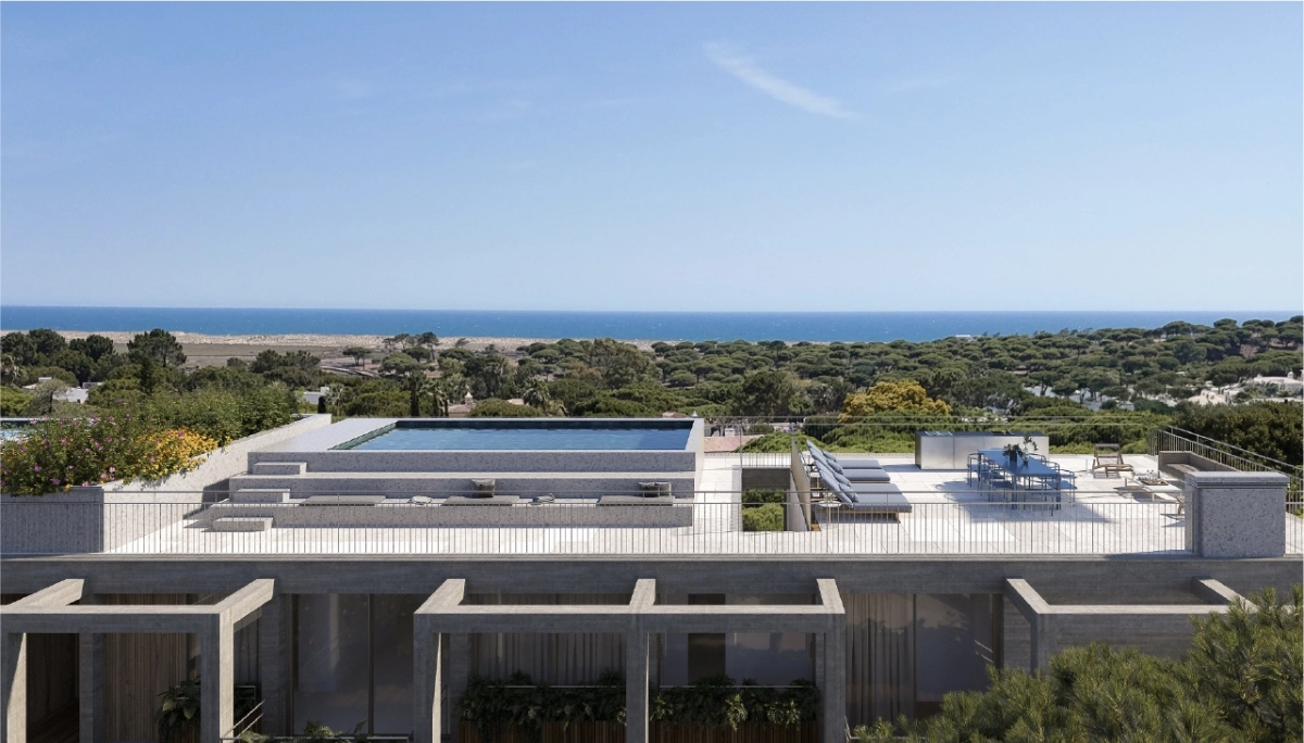
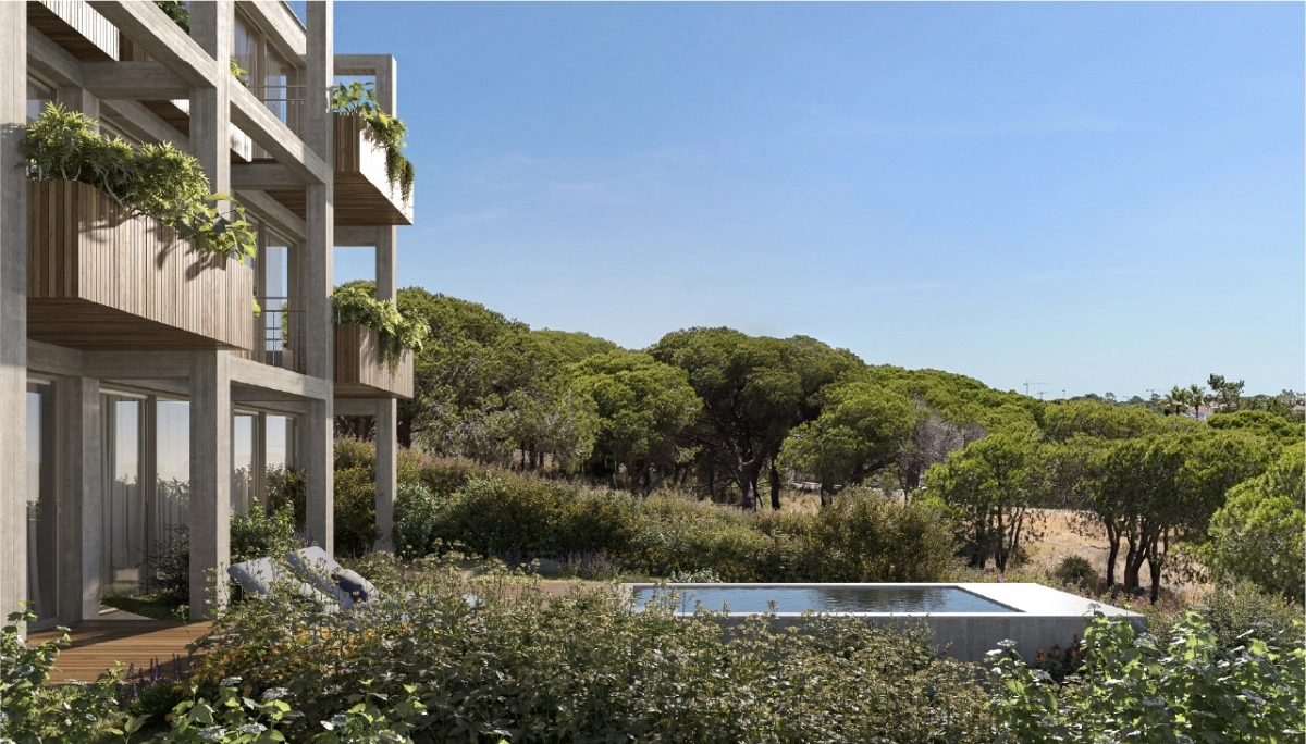
On one of the last plots of land between Quinta do Lago and Vale do Lobo, this project offers a different approach: sixteen apartments ranging from 85 m² to 150 m², designed by the Carvalho Araújo studio, with an independent resort management. A turnkey solution where owners don’t need to manage teams or services — just enjoy all the amenities or rent out the property when they are not there.
Minimalist lines, natural materials and a direct relationship with the landscape translate into architecture that does not need to impose itself to be exclusive. Between the pine forest, the Ria Formosa, the Atlantic and the sky, the project positions itself as an alternative to monumental villas — with the same privileged location, but without the operational complexity.
Where architecture meets the horizon.
Challenge.
The challenge was to create a brand in a market saturated with conventional luxury offerings. How toposition sixteen small-scale apartments as a credible alternative to the large villas in the area? How to communicate exclusivity through restraint rather than excess?
It was necessary to translate into a brand what differentiates the project and makes it relevant in an Algarvewhere real estate projects continue to proliferate.
Insight.
Immersion revealed that the project is born of the convergence of four clear values.
- Location: between the Ria Formosa and the sea, under the blue skies of the Algarve. A unique position that defines the experience.
- Curiosity: the desire to discover the Algarve as it is. The scale of the apartments requires openness to the outside world — integration into the territory, not isolation.
- Intimacy: apartments that do not need to be large to be exclusive. A minimalism that contrasts with the typical ostentation of Quinta do Lago.
- Respect: for the place, for nature, for people, for traditions. A way of being that does not appropriate the territory, but dialogues with it.
Concept & Brand Expression.
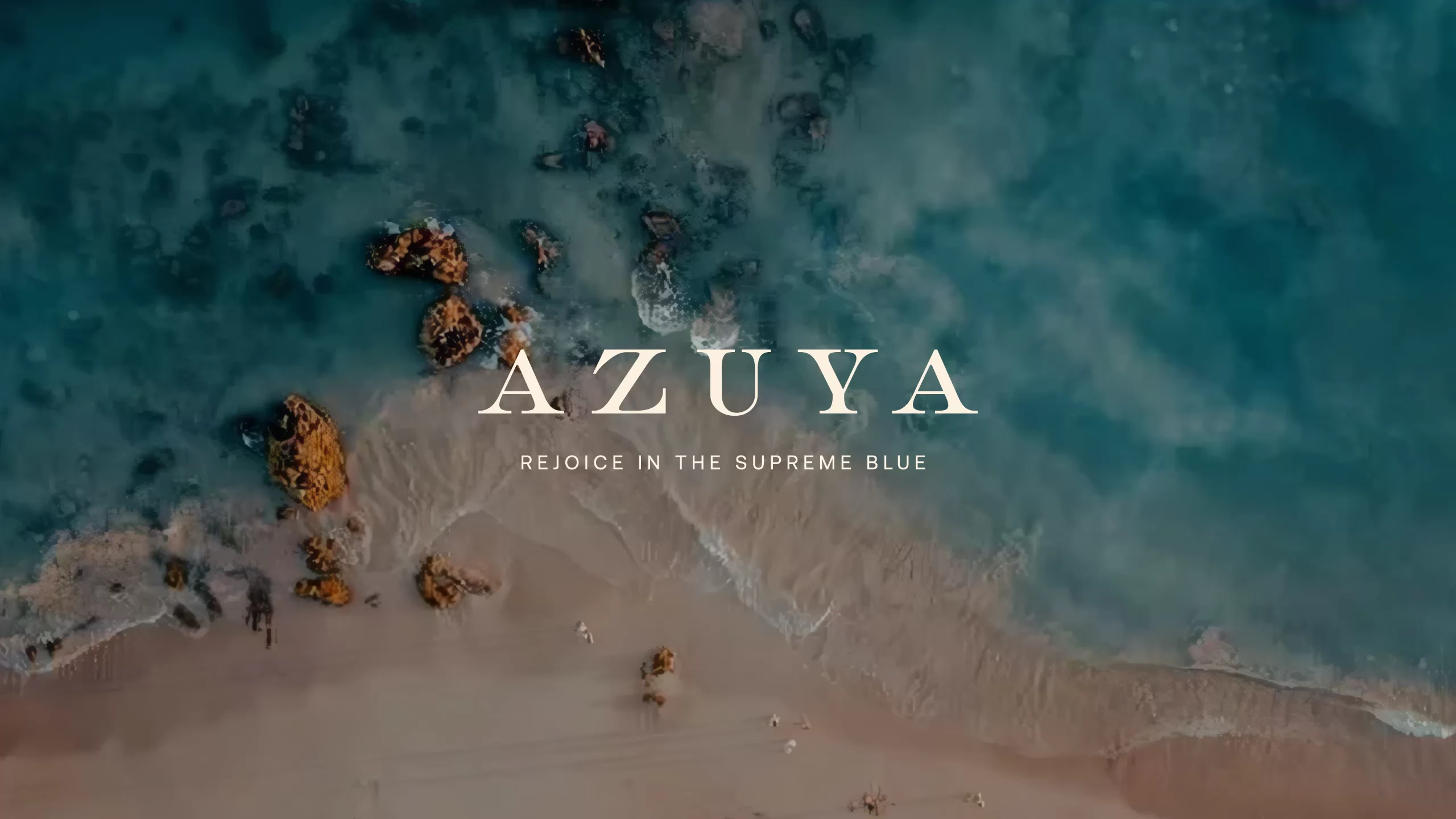
Between the pine forest and three blue horizons — the Ria Formosa, the Atlantic and the sky — we created the name Azuya. A fusion of the three blues that define the location, philosophy and experience of the project.
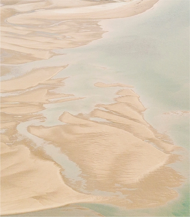
The blue of the estuary: where nature guides. The blue of the sea: where inspiration comes in waves. The blue of the sky: where dreams dwell.
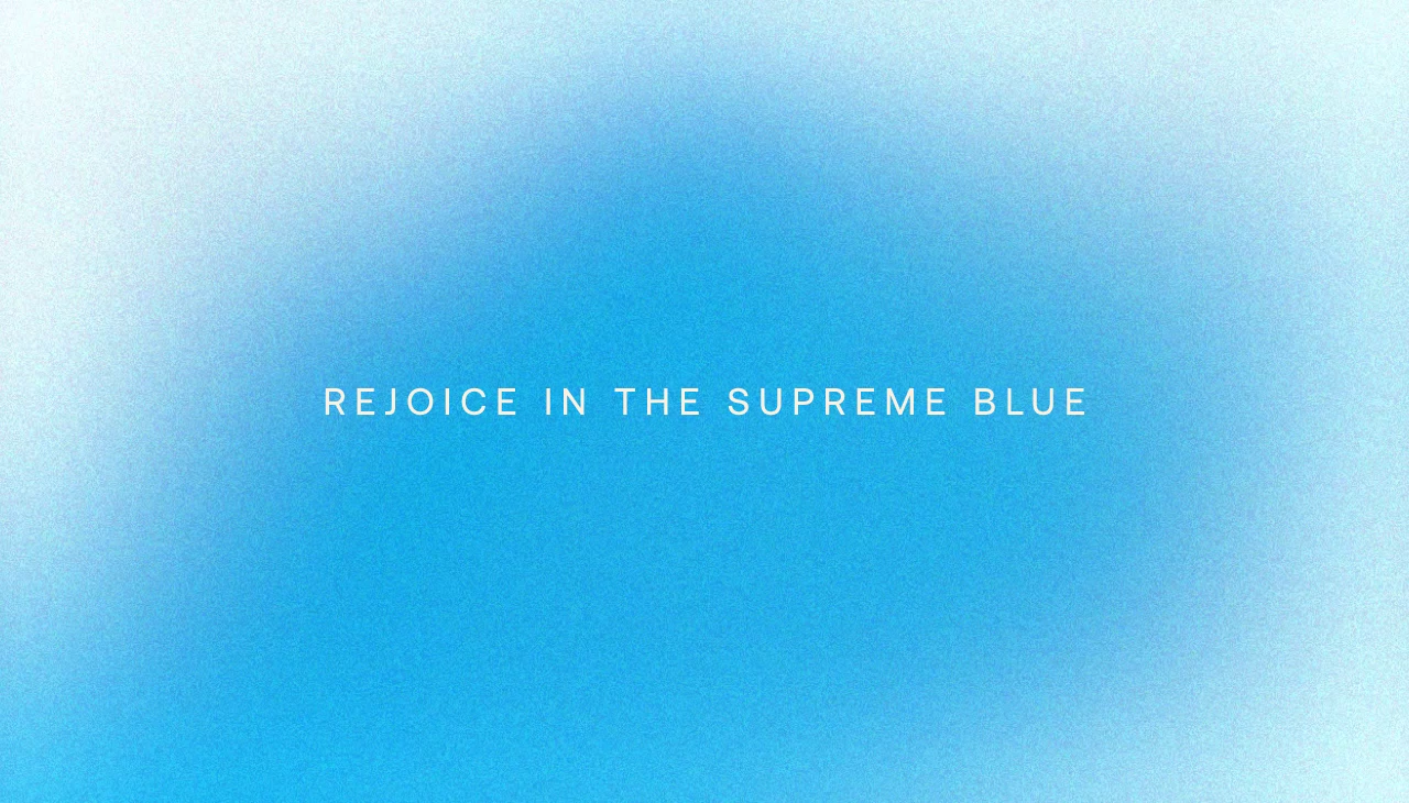
“Triple Blue” became the way to express the unique location and positioning: a place where luxury is measured by authenticity and the relationship with the territory, not by scale or ostentation.
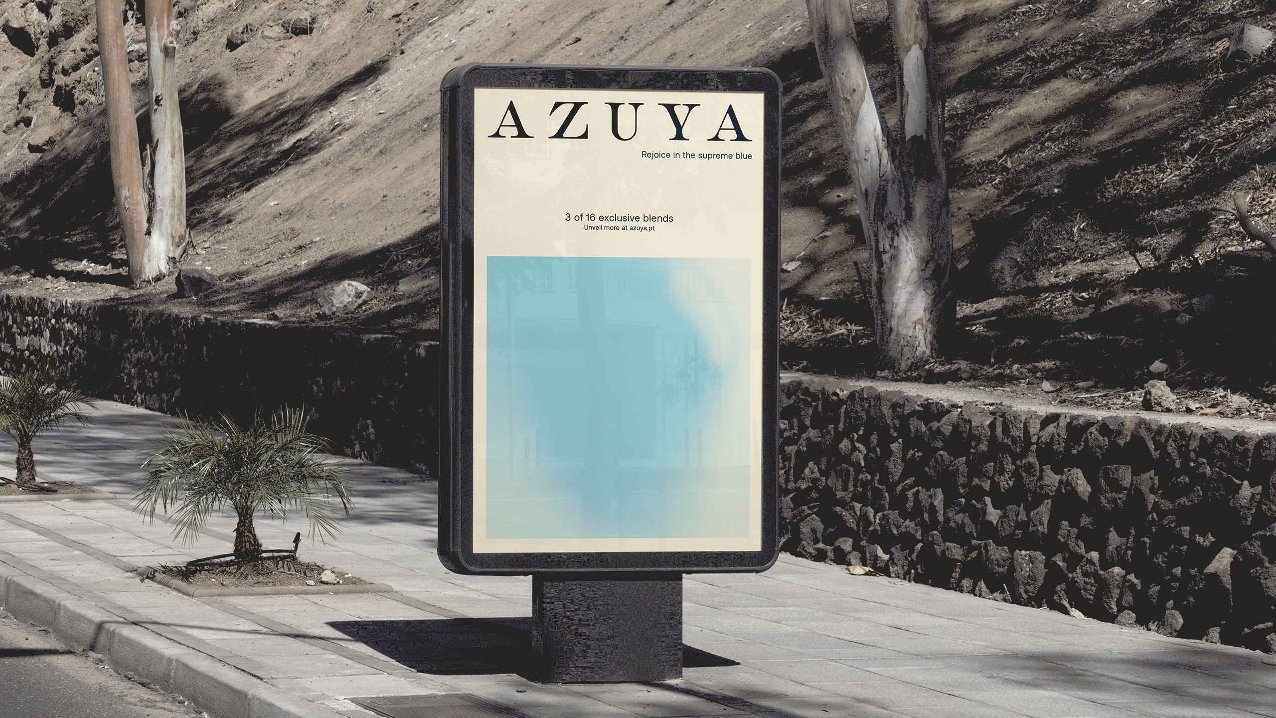
The visual identity reflects this balance. The colour system derives from the fusion of the three blues, creating a proprietary blue that changes depending on the light — just like the Algarve landscape. The typography and photographic treatment reinforce the discreet sophistication and openness to the outside world.
The communication was designed to convey exclusivity in a low-key way, positioning Azuya as a discovery for those seeking the Algarve in its most genuine form.
